It would be revolutionary if a special font could improve the reading performance of children and adults with dyslexia. Or if a font can boost brain-based skills like memory.
Special fonts for dyslexia
Dyslexia is a learning difficulty that affects an individual’s capacity to read and is linked to difficulty in identifying letters, syllables, and words — despite suitable schooling and in the absence of intellectual or sensorial deficiencies. Dyslexia affects, on average, one child in every class and 5 percent of the world’s population.
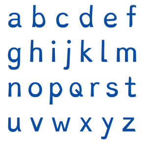
Dutch graphic designer Christian Boer developed the font “Dyslexie” in 2008. He aimed to create a font that would stop the letters from looking like they were spinning or moving. Dyslexie has been used in several primary schools in the Netherlands, and Dutch publishers have printed books in this font.
Since 2011, the font has also become more prominent in English, and English-speaking countries such as Australia have started to print books in Dyslexie. The font has received much media attention worldwide (e.g., TheGuardian.com, Slate.com, TheAtlantic.com, USA Today, and io9.com).
Another font, OpenDyslexic, was released in 2011. It is considered dyslexia-friendly because it is mostly sans-serif. Ablerado Gonzalez created this font in order “to help dyslexic readers.”
How effective is Dyslexie font?
A study by Marinus et al. (2016) aimed to examine if Dyslexie is indeed more effective than a commonly used sans serif font (Arial) and, if so, whether its relatively large spacing settings can explain this.
Participants were 39 low-progress readers who were learning to read in English. They were asked to read four different texts in four different font conditions that were all matched on letter display size (i.e., x-height) but differed in the degree to which they were matched for spacing settings.
Results showed that low-progress readers performed better (i.e., read 7% more words per minute) in Dyslexie font than in standardly spaced Arial font. However, when the within-word spacing and between-word spacing of Arial font were matched to that of Dyslexie font, the difference in reading speed was no longer significant.
The authors conclude that the efficacy of Dyslexie font is not because of its specially designed letter shapes but because of its particular spacing settings.
Increased spacing makes a difference
Increasing the spacing between characters and words in a text improves the speed and quality of dyslexic children’s reading without prior training. They read 20 percent faster on average and make half as many errors. This was the conclusion reached by a French-Italian research team.
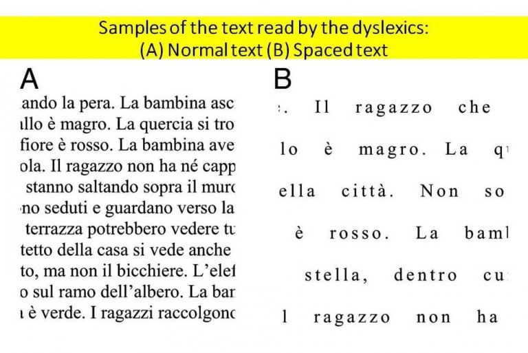
In this study, the researchers tested the effects of letter spacing on the reading ability of 54 dyslexic Italian and 40 dyslexic French children aged between 8 and 14 years. The children had to read a text composed of 24 sentences, in which the spacing was either normal or wider than usual. The results, published in the Proceedings of the National Academy of Science, showed that wider spacing enabled the children to improve their reading both in terms of speed and precision. On average, they read 20 percent faster and made half as many errors.
“The increase in speed was notable,” said cognitive scientist Marco Zorzi at the University of Padua, who led the research group. “It corresponds to the increase you would see after one year of schooling.”
This progress could stem from the fact that dyslexic children are particularly sensitive to “perceptual crowding,” in other words, the visual masking of each individual letter by those surrounding it. The results of this study show that this crowding effect may be reduced by spacing letters apart.
Study confirms value of increased spacing
Published in the journal Research in Developmental Disabilities, a study by Stagg and Kiss (2021) tested the effect of increased spacing between letters on dyslexic children and a comparison group of non-dyslexic children. Participants read four texts with either standard or extra-large letter spacing with or without a colored overlay.
The dyslexic group showed a 13% increase in reading speed, while the comparison group of non-dyslexic children showed a 5% increase in reading speed. In contrast, colored overlays had no impact on reading speed.
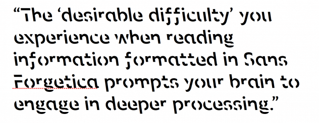
Does ‘Sans Forgetica’ boost memory?
It has also been claimed that the font Sans Forgetica could enhance people’s memory for information. However, researchers from the University of Warwick and the University of Waikato, New Zealand, found after numerous experiments that the font does not enhance memory.
The Sans Forgetica font has received much press coverage after researchers in Australia claimed they had designed a new font that would boost memory by making information in the new font feel more difficult to read — and, therefore, remembered better.
The original team studied 400 students, finding that 57 percent remembered facts written in Sans Forgetica, whereas 50 percent remembered facts written in Arial.
No evidence found
But a team of scientists led by the University of Waikato, New Zealand, and involving the University of Warwick, published their findings in the journal Memory. After four experiments, they found no evidence of memory-boosting effects.
Across the four experiments with 882 people, this scientific team found that Sans Forgetica feels harder to read than Arial. When they showed people pairs of words in Sans Forgetica or Arial, people recalled fewer Sans Forgetica pairs than Arial pairs.
They also found that when people were shown educational information in Sans Forgetica and Arial and tested their recall or understanding, there was no evidence that Sans Forgetica improved their performance.
Edublox offers cognitive training and live online tutoring to students with dyslexia, dysgraphia, dyscalculia, and other learning disabilities. Our students are in the United States, Canada, Australia, and elsewhere. Book a free consultation to discuss your child’s learning needs.
.
Reference:
Marinus, E., Mostard, M., Segers, E., Schubert, T. M., Madelaine, A., & Wheldall, K. (2016). A special font for people with dyslexia: Does it work and, if so, why? Dyslexia, 22(3), 233–244.